ハヤテのごとく!/Hayate no Gotoku Manga
Hayate the Combat Butler Chapter 470 Review
SPOILER Summary/Synopsis:
 The first chapter of the manga get redressed in the modern style, all the way to where Hayate got fired from his bicycle courier job, only this time, Ayumu is in the group of friends who came to see him.
Nagi cuts this off, saying people should read the first chapter if they want to know that story.
Nagi wants to show off her manga, but Hayate turns that offer down.
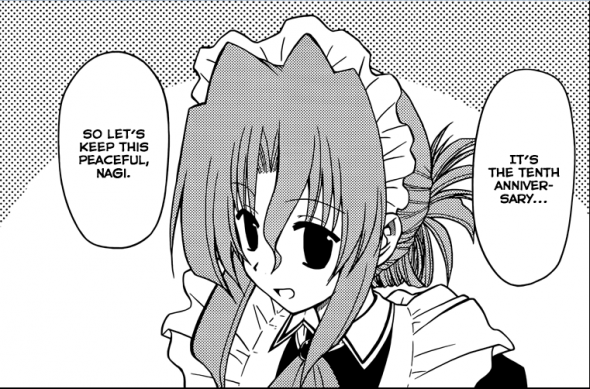
Maria shows up, shocking both Nagi and Hayate by having her original character design. However, they want things to go back to the current design.
Hayate asks what the biggest impact on Nagi has been over the last ten years. She says it was when she (Hata-sensei) was almost sued, but who by is censored out. Nagi recounts other things, speaking for Hata-sensei.
Hayate wakes up from his dream.
Thoughts/Review:
Heh!heh!heh! Congrats, Hata-sensei! Ten years is quite an accomplishment.
It was fun seeing the introduction of the first chapter redone, even if it is in the inferior, current character design.
I can understand why Hata-sensei changed things to have Ayumu in there. It would make more sense for her to be there, based on how things turned out.
I wonder who was going to sue Hata-sensei. I figure some nutter (or company) were wanting to claim plagiarism.
All that aside, for me, the best part was seeing Maria in her original character design. For some reason, I was somewhat surprised at how easily Hata-sensei shifted back to that design. Maria looked lovely. I’ve long said that the old character designs gave the characters more personality. It really is a shame that Hata-sensei is using this current, simplistic character design. I think he is doing that because it is easier and quicker to draw.
Otherwise, not much to talk about since this was a oneoff story just for the 10th anniversary.


 October 31st, 2014
  AstroNerdBoy
 Posted in
  Tags:
Tags: 
I dunno… I actually slightly prefer the new character designs better than the old one. I liked how Nagi looked in the remade color pages compared to the old one. The older designs definitely had more details, especially on the clothes and hair, but the eyes look somewhat creepy and there’s something off about the anatomy even in that Maria done in the older style (though that could be intentional). Hata also had a problem with the consistency of the art during those times. There were numerous pages with ink bleeds and sometimes the faces just looked wrong. So yeah, over-all, I prefer the consistency and professionalism of the current design… although I would prefer it if the design was closer to the ones used in HIAPOE — or the transition designs in the Ruka arc. I don’t think the slightly cut down (probably more realistic) hair on everyone suits them very well.
The original character designs are not as good as they were by the time just before the Golden Week trip.
As to the eyes, the only eyes that bothered me were Ah-tan’s eyes in the flashback. They were too big, in my opinion. Now, most of the faces/eyes look the same, thus the character loses personality, which is unfortunate.